Hi! My name is Maria Graham.
Welcome to my portfolio page for PP434 - Automated Data Visualisation for Policymaking.

CC1: Hosting

View Hosting Task

Set up your own GitHub account and live page using GitHub Pages. Add two charts using the vegaEmbed function (one from the course repository and one from an external web source).

Chart 1: Added from Richard's Repository

Chart 2: Added from the web

CC2: Building

View Building Task

Build two separate charts using the "create" tool from the Economics Observatory Data Hub. Embed both charts into your page using the vegaEmbed function.

Chart 3: Unemployment rate in Ethiopia

Chart 4: Internally displaced people in Ethiopia

CC3: Debate

View Debate Task

Produce two charts that support or refute (or relate to) a topic of policy debate.

Policy Question: Should the UK Implement Targeted Obstetric Care Programs for Ethnic Minority Women?

Together, these charts reveal clear disparities in maternal and neonatal mortality among ethnic minority women, suggesting that current universal maternity and neonatal services are insufficient at addressing the specific risks faced by these demographic groups.

CC4: Replication

View Replication Task

Find a chart used by a policy organisation, journalist, think tank, television channel, or company. Replicate it, then improve on it.

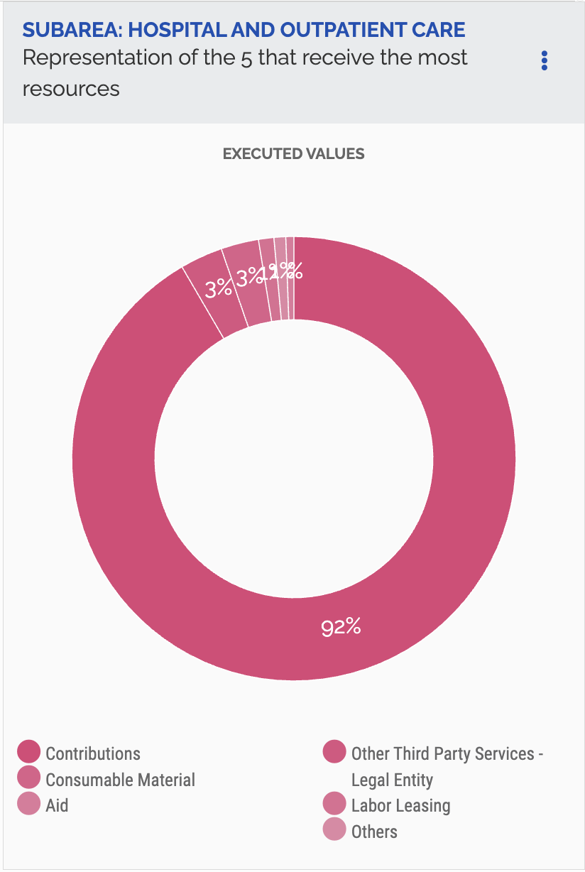
I found this chart on the Brazilian Government's Transparency Portal website. It gives an overview of how spending is distributed within the Hospital and Outpatient Care sub-area.

Original:

My Replication:

My Improvement:

This improved version converts the original pie chart into a bar chart to make comparisons between categories clearer. It also replaces layered, fixed labels with hover tooltips to reduce clutter and improve readability. Finally, each category is given a distinct colour from the accessible Okabe–Ito palette to make groups easier to differentiate.

CC5: Accessing data: Scraper and API

View API Task

Add a chart to your site that uses a live link to an API. Below the chart, add a functional description of the API.

Functional Description of API

Base URL:
https://api.worldbank.org/v2

Endpoint: /country/{country_code}/indicator/{indicator_code}
• {country_codes} → GBR;JPN;CAN;USA;FRA;DEU;ITA
• {indicator_codes} → EN.GHG.CO2.PC.CE.AR5

Parameters:
• format=json → Specifies the response format as JSON
• per_page=455 → Requests 455 results per page

Complete URL: https://api.worldbank.org/v2/country/GBR;JPN;CAN;USA;FRA;DEU;ITA/indicator/
EN.GHG.CO2.PC.CE.AR5?format=json&per_page=455

View Scraper Task

Using a Google Colab python notebook, scrape a website. Then clean and normalise the data and export into TIDY (long form) format.

Olympic medal table data were scraped from Wikipedia using Requests and BeautifulSoup, then cleaned, sorted by total medals, and reshaped into long format by medal type. A minor challenge was needing specifying a user-agent to access the page.

CC6: Loops. Build a Dashboard

View Loops Task

Use a loop to batch download six different series as JSON files. Also use a loop in your Javascript in order to embed the six charts

To create the dashboard below, I used a JavaScript loop to batch query the UK Police Crime API by crime category and visualised the top five streets by incident count for each offence type.

CC7: Maps. Base Maps and Choropleths

View Maps Task

Produce two maps and embed them in your portfolio page. One map should be of Scotland, the other should be of Wales.

Coordinates Map:

Choropleth Map:

CC8: Big Data. Extracting a story from millions of prices.

View Big Data Task

Produce two charts using either of the two UK prices datasets provided in class. Explain, in no more than 50 words, what you have done.

Using the Long Run Prices Database, I selected products based on their description names and alignined them to a common start and end date to create a consistent time series. Prices were averaged to smooth short-term variation. The first chart aggregates the average monthly prices of ingredients used to make sangria, showing how the prices of these goods have evolved alongside inflation over time. The second chart examines average kebab prices over time, disaggregated by UK region to explore regional variation in price levels and dynamics.

CC9: Two Interactive Charts.

View Interactive Task

Produce two charts that include interactivity. It could be a slider, drop-down box, clickable legend. Or any other form of interactivity that allows the user to better understand your data.

Use the slider to see how neglected sites have emerged spatially across Glasgow over the past 40 years.

Select a deprivation domain from the drop-down menu to see how median SIMD ranks vary across different distance bands following the regeneration of a nearby derelict site.

CC10: Advanced Analysis and Machine Learning.

View Advanced Analysis Task

Produce a chart that uses more advanced analytics than standard line, bar or scatter charts. This could include any of: Bubble, histogram of distributions, de-trended (including univariate regression), shock analysis, Diff-in-Diff, heat maps.

View Machine Learning Task

Conduct an applied data analysis using any of the machine learning techniques taught in the Week 10 lecture and seminar. One option is Supervised learning (Regression or Classification); another is the Unsupervised learning (Clustering or Dimensionality reduction) method.

Hypothesis: A data zone's deprivation profile can predict its distance to the nearest derelict or vacant land site.

Interpretation: Deprivation indicators predict distance with weak accuracy (R² ≈ 20%), indicating some predictive power but still significant unexplained spatial variation.

Appendix

Colab Notebooks
Academic Integrity Statement

Generative AI tools were used to aid in troubleshooting and assist with CSS styling. All analysis, interpretation, and conclusions are my own.